
22.07.20257 mins read
I recently upgraded my phone, you know, the “free” upgrade that comes with overpaying monthly on your contract.
Anyway, it’s bigger than my previous one, and I’ve even made it bigger again with my new indestructible case, which I need because I drop my phone freakishly often.
It barely fits in my pocket, but let’s be honest—I’m always on my phone anyway. Whether I’m scrolling, shopping, answering emails, or looking things up, it’s practically an extension of my hand. And I’m not alone.
In Ireland, we spend an average of 52 minutes per day on social media, 30 minutes streaming music, and 27 minutes browsing the internet—all from our mobile devices. And according to PwC research, much of that browsing is about making purchasing decisions:
- 48% of Irish consumers frequently research products on their smartphones before buying.
- 27% use retailer apps to compare products.
- 24% check prices and product details on their phones while in-store.
Simply put, companies can’t afford to treat the mobile experience (MX) as an afterthought. A seamless, intuitive mobile experience isn’t a luxury; it’s the difference between keeping customers engaged or losing them to frustration.
When consumers interact with a brand on their phones, they typically do so in one of two ways:
Apps are built specifically for a device’s operating system (iOS or Android). However, the problem, or challenge, is getting users to download—and actually use—the app. It won't last long on their home screen if it doesn’t offer real value (think convenience, personalisation, or exclusive offers).
Many mobile sites are still just resized versions of their desktop counterparts.
However, not all are equal. The best ones take a mobile-first approach. Leveraging technologies like Progressive Web Applications (PWA) and Single Page Applications (SPA), they can function just like a native app—without requiring a download.
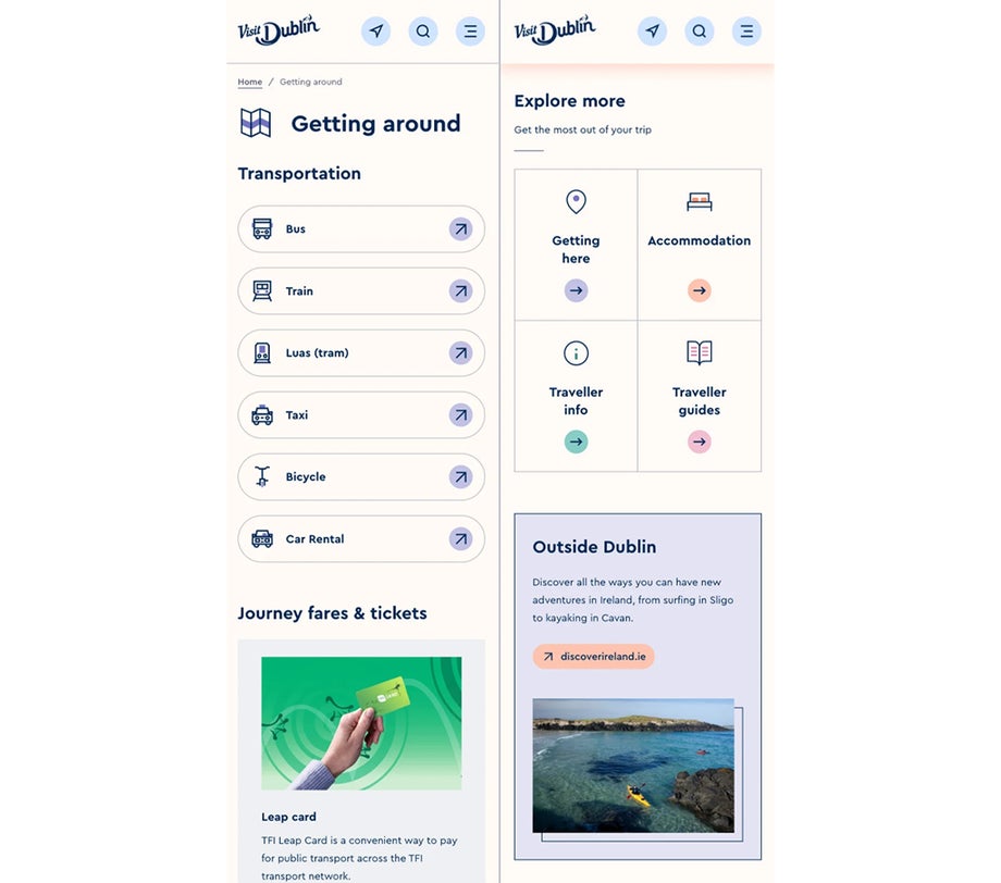
As part of our work with Fáilte Ireland and the Visit Dublin website, we built it using PWA and SPA technologies to ensure mobile users enjoy a seamless, app-like experience:
- PWA preloads key data in the background, so pages load instantly.
- SPA ensures that only the necessary elements update as users navigate, eliminating full-page reloads and making everything feel smoother.
It’s not just about shrinking your website to fit a smaller screen—it’s about making every interaction easy, fast, and enjoyable.
Here are the top 8 key factors to create a seamless MX that keeps users engaged and coming back for more:
One of the biggest frustrations with mobile (and desktop) is slow page load times.
The ideal load time: Under 2 seconds for desktop, under 1 second for mobile.
Research shows that a 1-second delay can reduce conversions by 7%, and 40% of visitors will abandon a website that takes more than 3 seconds to load.
- Optimise images
- Minimise JavaScript
- Use efficient coding practices
A fast site isn’t just better for user experience—it’s better for business.
For example:
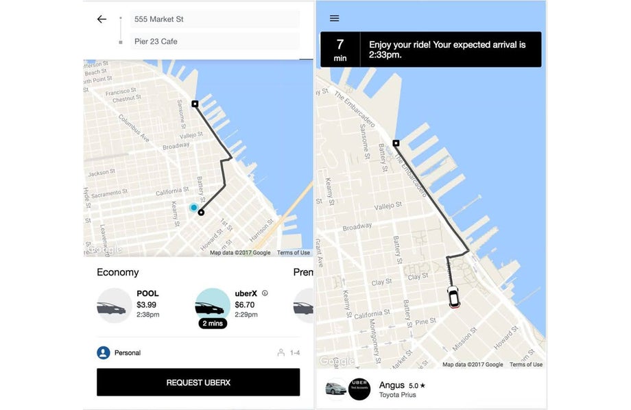
To ensure fast access for users across all locations and devices, Uber rebuilt their web client (m.uber.com) as a lightweight alternative to the native app. The core ride request app is just 50kB, enabling it to load quickly even on 2G networks. It delivers an app-like experience in all modern browsers, including on low-end devices, making it ideal for global markets with slower connections
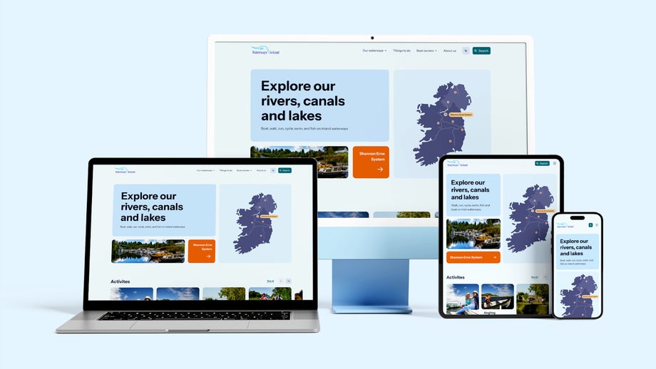
Responsive design ensures that images, text, and buttons adapt properly to different screen sizes.
- Images should resize properly on all devices.
- Buttons and CTAs should be large enough to tap easily.
- Key content should always be visible without excessive scrolling.
Even with larger phones, they’re still smaller than desktops, and users are often multitasking. Keep the experience clear, concise, and easy to navigate.
- Prioritise content—put the most important information upfront.
- Make navigation intuitive—users shouldn’t have to think.
- Reduce unnecessary steps—friction leads to drop-offs.
Inclusive design means more users and, therefore, more opportunities for increased engagement and conversions.
According to the World Health Organisation, over 1.3 billion people – 15% to 20% of the global population – experience disability. This group, along with their friends and family, has a spending power of $13/ €11 trillion.
Shutting this audience seems like an obvious misstep.
We talk a lot about digital accessibility, and for brands operating within the EU, it is now a legal requirement for those who fall within the scope of the European Accessibility Act (EAA) 2025.
For more information on what this means and how you can ensure compliance with the EAA 2025, please check out the following:
- Time is running out: How to ensure your digital assets comply with the new EU Accessibility Act
- Accessibility- who owns it?
- Why digital accessibility must be on your roadmap
- What is AI’s impact on accessibility?
- How to make your site accessible
- Making the web accessible and addressing common errors
The BBC’s Global Experience Language (GEL) is widely recognised as a leader in accessible mobile design. GEL is built on the principles of clarity, consistency, and inclusivity, ensuring that every BBC product—whether a news article, app, or interface—works seamlessly across devices and for all users, including those with disabilities.
On mobile, GEL ensures that layouts are clean and readable, tap targets are appropriately sized, and all content is structured for screen readers. High colour contrast, intuitive navigation, and extensive user testing across assistive technologies make the BBC a benchmark for mobile accessibility done right.

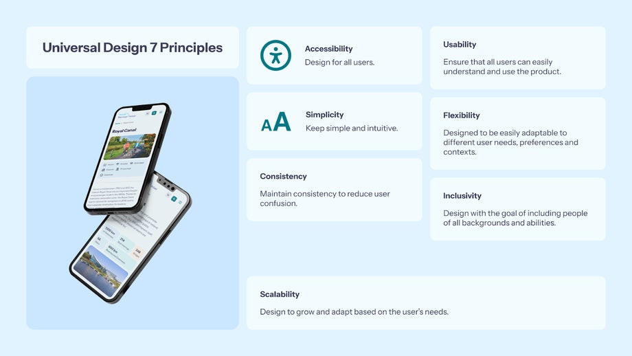
At All human, we’ve been prioritising inclusive design for years now. We incorporate the 7 principles of Universal Design into our work, ensuring our products meet international standards, such as WCAG 2.0, which aligns with current legislation requirements. This supports our clients' adherence to relevant regulations.
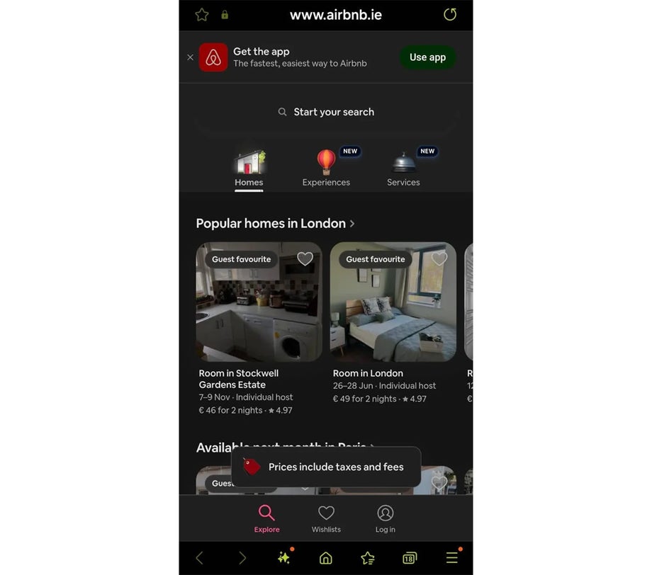
Users experience your brand across multiple channels—from TikTok to email newsletters. Ensure that branding, messaging, and UX feel seamless across all platforms. No one likes to go from, say, an ad on YouTube that is smart, sassy and sleek and end up on a site that is the complete opposite. While the different platforms do allow for some differences, there should be a common sense of a single brand identity.
Airbnb maintains brand consistency across its mobile web, native app, and marketing channels. From visuals to tone of voice and user journey design, the experience feels seamless no matter how or where a user engages. This builds trust and familiarity, encouraging bookings across all touchpoints.

While mobile browsing has become an increasingly popular pastime, it is not the only way people interact with a brand. Whether users are accessing services or browsing products, offline capabilities allow them to continue their journey—viewing cached information, saving their progress, or completing tasks when there’s no internet connection. This is particularly important in areas with unreliable connectivity, as it can prevent users from abandoning their session or getting frustrated, keeping them engaged and ready to pick up where they left off once they’re back online.
With Google’s mobile-first indexing now the default, mobile optimisation is no longer optional—it’s critical for both user experience and search engine visibility. Ensuring your mobile site is optimised isn’t just about providing a better experience; it’s a key factor in how your site ranks.
Why does mobile SEO matter?:
- Mobile-first indexing: Google now ranks websites based on their mobile versions. If your mobile site isn’t optimised, it can harm your rankings across all devices.
- User experience: Google also prioritises websites that offer a smooth, mobile-friendly experience. Fast load times, easy navigation, and clear content are crucial for better rankings.
The golden rule here is to simplify the process.
- Enable Google Pay and Apple Pay. They make it very easy to spend!
- Integrate biometric authentication to bump up the feeling of security and reduce risks.
- Minimise the number of steps for returning customers by enabling autocomplete for payment and shipping details.
A seamless payment process doesn’t just improve customer experience—it fosters loyalty. Mobile payments that allow users to complete purchases effortlessly (like redeeming loyalty points or vouchers directly at checkout) enhance the experience and build trust, encouraging repeat business.
As our reliance on our smartphones increases, so too will what we use them for and ensuring you deliver a great MX will increase the likelihood of conversion and of establishing customer loyalty.
